To Meetus by Hellocean
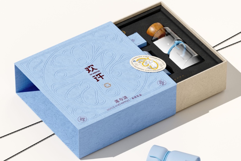
“欢许” (To Meetus) is an incense and aromatherapy brand that draws its identity from the poetic imagery of lotus flowers and rippling water.
“欢许” (To Meetus) is an incense and aromatherapy brand that draws its identity from the poetic imagery of lotus flowers and rippling water.
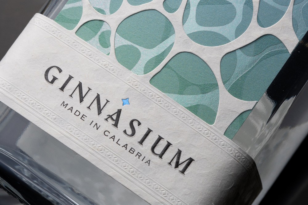
Contrasti (Contrasts) is a Premium Craft Gin label designed by Studio La Regina for Ginnasium 2025. Ginnasium is an Italian neuromarketing research project in which twenty design studios, one per region, explored how packaging details shape the consumer’s emotional response.
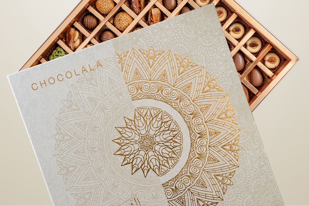
This Ramadan chocolate packaging project was developed as a premium rigid gifting box that combines cultural storytelling with manufacturing discipline—designed to protect delicate assorted chocolates while delivering a ceremonial unboxing experience. The concept centers on a radial geometric mandala motif that reads as heritage-inspired ornamentation at first glance, then reveals its precision through gold foil …
Ramadan Mandala Chocolate Gift Box by Shabouk Printing & Packaging Read More »
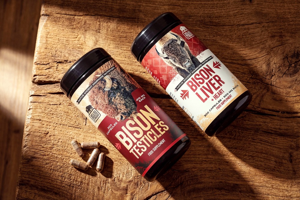
For this product line, we designed a striking packaging for nutritional supplements that communicates the power of nature and the authenticity of the raw materials. The dominant element of the packaging design features illustrations of animals – bison and deer – symbolizing the origin of the ingredients and natural vitality. The packaging composition works with …
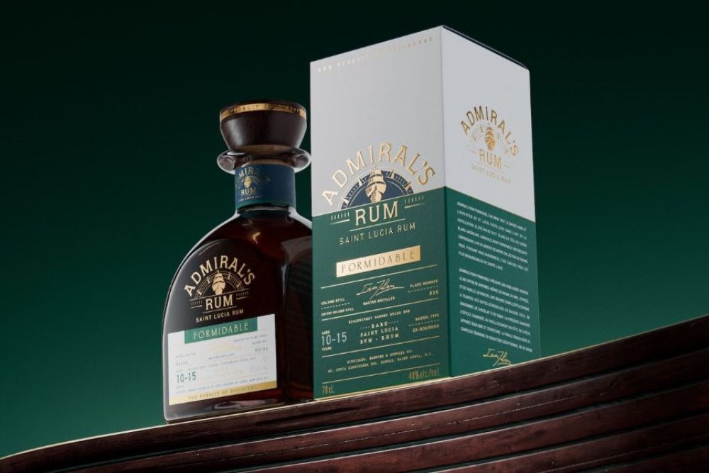
Appartement 103 unveils the new identity for Admiral’s Rum: a strategic repositioning for Saint Lucia’s iconic rum brand
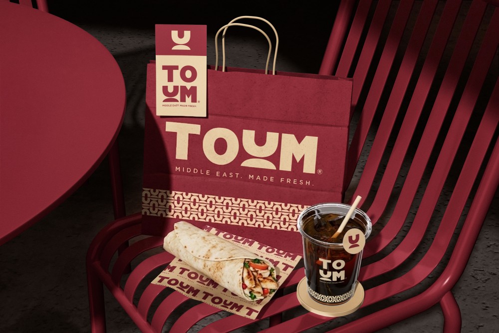
TOUM is a premium Middle Eastern & Made Fresh shawarma and coffee brand crafted for a refined, modern audience. Inspired by the rich culinary heritage of the Middle East, the brand blends authentic flavors with a contemporary café experience, delivering quality, freshness, and elegance in every detail.
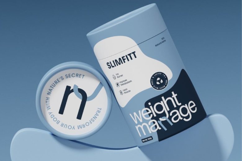
Weight Manage is a modern wellness brand focused on simplifying weight management through natural, effective solutions. For this project, we crafted a clean and minimal packaging system designed to communicate clarity, trust, and functionality in a highly competitive health and supplement market.
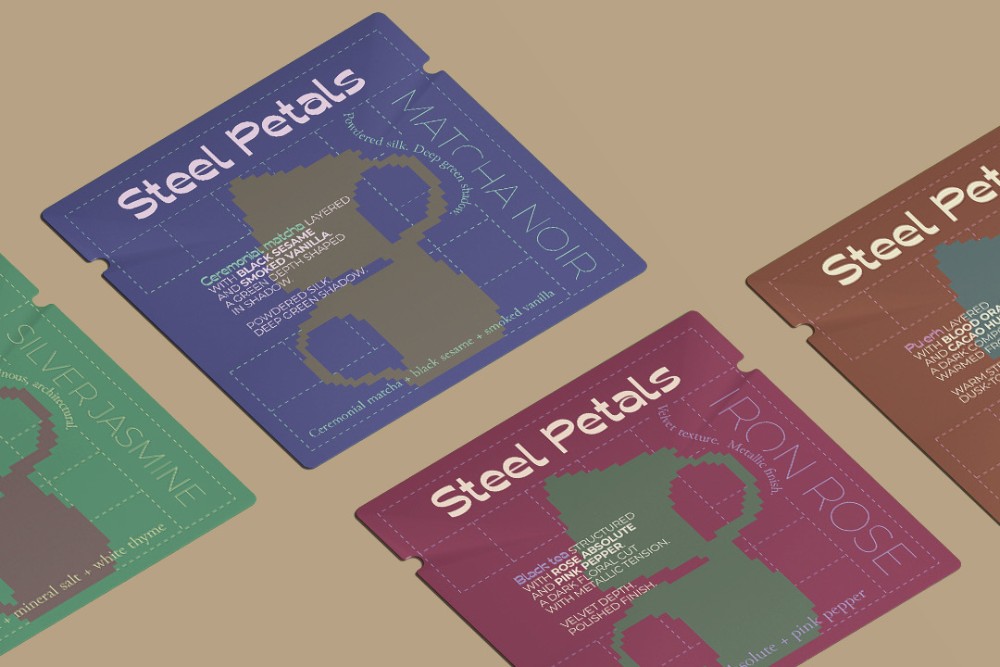
Steel Petals is a conceptual tea brand where structure meets softness.
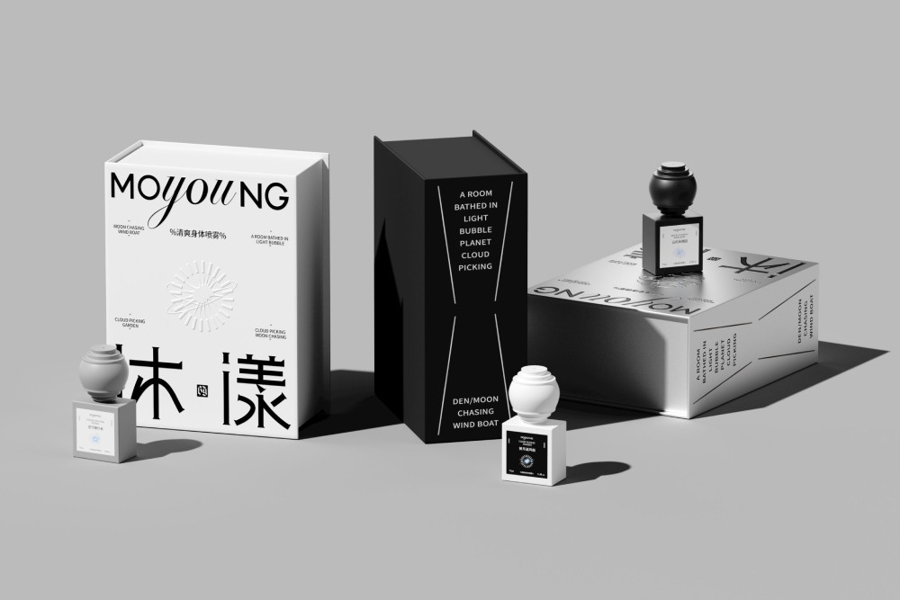
The MOYOUNG body mist packaging presents a refined balance of sculptural form and minimalist branding. Defined by its bold monochrome contrast, the design pairs matte black and soft white bottles with a distinctive, rounded cap that introduces a tactile, almost architectural silhouette. The square base reinforces stability, while the oversized cap adds a sense of …